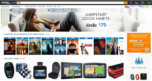
Amazon has been working on a new design since July of last year and it looks like the company has begun to roll out that new design to some of its users. The change is likely meant to convince buyers to spend even more money on the wide variety of products the giant retailer has in stock, and can be seen on a many Internet browsers, regardless of whether the user is signed in or not.
If you were to surf on to Amazon right now, you may or may not notice the new design which features a dark and black bar at the top, while previously it was a white background with Amazon’s logo at the top left hand corner of the page. The new Amazon page also looks a lot more compact with more products and information being squeezed into the front page of the website compared to before where it was slightly more spread out. The redesigned website also features a new drop down menu where visitors can go to the company’s Fire and Kindle product pages directly.
An Amazon spokesperson said the new look remains a test, saying only that “we are constantly looking for ways to improve the shopping experience for our customers.”