
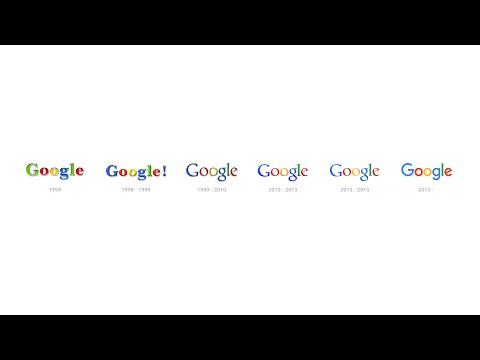
Google has evolved. The search giant has just introduced its new logo, and it is the biggest visual overhaul for the most commonly seen word on the internet in sixteen long years.
Gone is the serif (the filigree on the ends of traditional print typefaces like Times New Roman) Google logo, replaced by a sleeker sans-serif version with no drop shadow. It looks like Helvetica, the famous typeface favored by Apple and countless modern companies worldwide, but it is actually called Product Sans, and is very much Google’s own creation. Yes, it is the same typeface we first saw at the big Alpahabet-Google reveal a few weeks ago. Google has also tweaked the spacing between letters, and the colours look noticeably softer than they were before.
![]()
The other big change now is that Google’s logo is no longer a boring old static image. Like many brands, they’ve shifted from a paper-first, static logo to a dynamic, animated figure that’s only possible on screens. When you pull up Google now, the letters transform into a series of four dots that morph and orbit with life. When you do a Google Now voice search, the logo will morph from “Google” into the dots, which undulate like water in anticipation of your query. As you talk, the dots will become an equalizer, reacting to the sound of your vocalizations. And when you’re done talking, the waveform become dots again, which spin as Google looks up your results. Then once the results are presented, the dots return to the familiar “Google” logo again.
Like any change to a familiar face, Google’s logo change might look odd for the first minute or so. But all you have to do is go back and look at yesterday’s (now old) logo to see that it really was time for an update. We will get used to it soon.
Here’s what Google has to say about the new logo on their official blog:
Google has changed a lot over the past 17 years—from the range of our products to the evolution of their look and feel. And today we’re changing things up once again:
So why are we doing this now? Once upon a time, Google was one destination that you reached from one device: a desktop PC. These days, people interact with Google products across many different platforms, apps and devices—sometimes all in a single day. You expect Google to help you whenever and wherever you need it, whether it’s on your mobile phone, TV, watch, the dashboard in your car, and yes, even a desktop!
Today we’re introducing a new logo and identity family that reflects this reality and shows you when the Google magic is working for you, even on the tiniest screens. As you’ll see, we’ve taken the Google logo and branding, which were originally built for a single desktop browser page, and updated them for a world of seamless computing across an endless number of devices and different kinds of inputs (such as tap, type and talk).
It doesn’t simply tell you that you’re using Google, but also shows you how Google is working for you. For example, new elements like a colorful Google mic help you identify and interact with Google whether you’re talking, tapping or typing. Meanwhile, we’re bidding adieu to the little blue “g” icon and replacing it with a four-color “G” that matches the logo.
This isn’t the first time we’ve changed our look and it probably won’t be the last, but we think today’s update is a great reflection of all the ways Google works for you across Search, Maps, Gmail, Chrome and many others. We think we’ve taken the best of Google (simple, uncluttered, colorful, friendly), and recast it not just for the Google of today, but for the Google of the future.
You’ll see the new design roll out across our products soon. Hope you enjoy it!